

Tech as part of art direction
Available technology and its limitations always influenced the visuals of video games, especially with 3D games. Before GPU rendering became the standard at the end of the previous century, games had to rely on raw processing powers of the CPU to render scenes. 3D games of the '80s used wireframe polygons, later giving them solid color fills. Arcade machines had the benefit of being able to use specialised hardware, however, polygonal environments on home computers had to be simplified even further or be rendered at frame rates, which from a modern standpoint would be completely unacceptable.
Stunts (1990) vs. Quake 3 Arena (1999). 9 years can make all the difference in the world.
The next decade saw a huge leap in terms of graphic capabilities. With lower hardware costs, 256 color VGA graphic cards and Intel 386 processors became available to the consumers - the exact hardware that made the immersive, fast paced and texture mapped Wolfenstein 3D (1992) possible, and so, kickstarting the FPS genre. Released only around 18 months later, Doom (1993) pushed graphics way beyond what Wolfenstein could offer and things just snowballed from there.
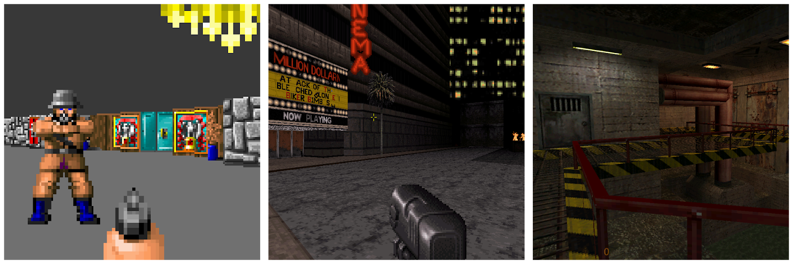
Evolution of realistic settings: Nazi fortress in Wolfenstein 3D (1992), streets of L.A. in Duke Nukem 3D (1996) and the industrial part of the science facility in Half-Life (1998)
Back when the First Person Shooter genre was still new and fresh, it provided the players with a lot of novelty and excitement, but created new challenges for the artists behind them. I’d like you tell you more about them, since by choosing the original Build engine, we had to face many of the same challenges as the developers did in the '90s. Our engine choice and goal of being faithful to this era of gaming, also greatly influenced our artistic decisions.
Three dimensions in service of flat images
Until the second half of the '90s, most games were not completely three dimensional. To make things simpler to process, or to add detail that wouldn’t be otherwise possible, some elements were still were conveyed using flat images. Since first person games feature fluid exploration of three dimensional spaces, environments had to be 3D, while characters, weapons and objects were depicted using 2D sprites.
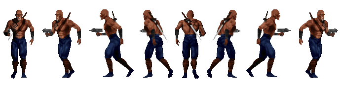
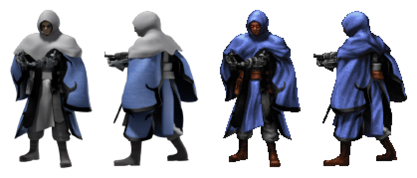
Lo Wang’s sprite from Shadow Warrior (1997) - three out of eight angles are mirrored.
In order to give them an illusion of three dimensionality, they had to be shown from different angles. Most static objects work well with a single camera-facing sprite or no animation, but the enemies were not only animated - they could be seen from all-angles in game. Creating all frames for such a monster, adds a lot to the artist’s workload and maintaining the same level of detail and consistency can be a challenge. Most artists quickly started looking for a better and faster way than painting them manually.
“Digitising” seemed like an obvious way to go - a term not used often now, digitising meant either scanning flat, hand-drawn or painted artwork to be used as a base for in-game pixel art (Many adventure games backgrounds were done this way), or capturing footage of real life objects with video cameras. Games like Doom (1993) or Blood (1997) used specially constructed poseable models for capture.
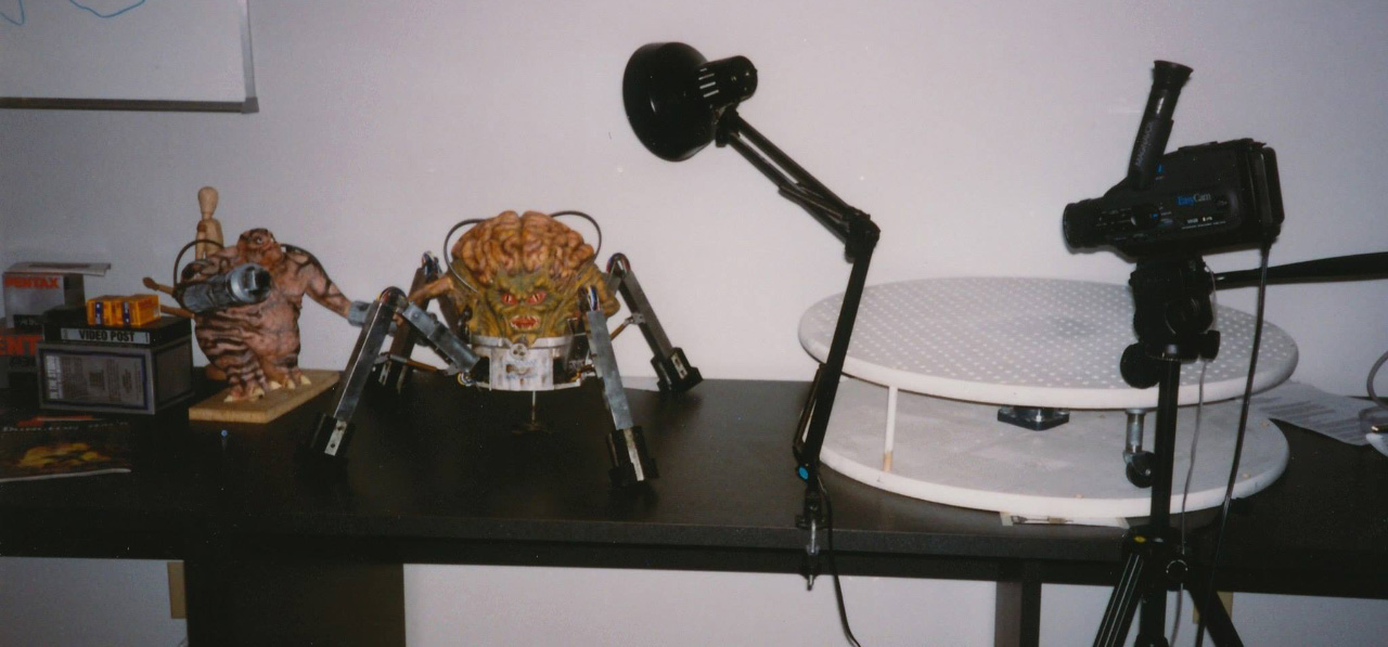
Turntable and models used to create sprites in Doom
Creative use of common objects or actors could also give great results - Doom’s weapons are based on store bought toys, and 3D Realms has digitised its own employees to be used as the enemy cultists in Rise Of The Triad (1994). A similar approach was used in William Shatner’s TekWar (1995) however, without adjustments, editing and polish done on the digitised sprites done by an artist, the end result looked rough, grainy and uninspired.
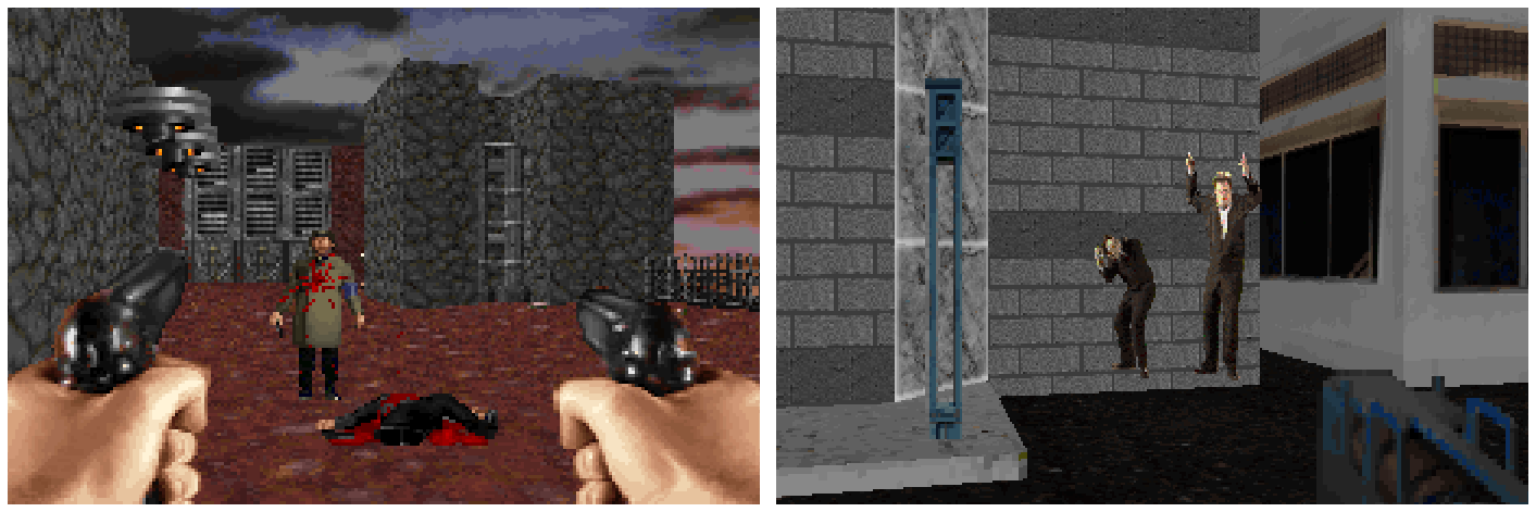
In comparison to Tekwar (right) ROTT offers a much more polished look.
3D graphic suites and computers became more powerful, and availability to artists increased in the '90s. Use of pre-rendered sprites, particularly in 2D games, felt fresh and exciting, and became a huge appeal of games like Donkey Kong Country (1994) on the SNES. 3D tools were an attractive prospect for the artists providing accurate perspective, lighting, material effects and automatic interpolation between keyframes which allowed for the creation of smooth animations, without animating each frame manually. The ability to freely place a camera and rotate objects in 3D was a great asset to the sprite artists working on FPS games.
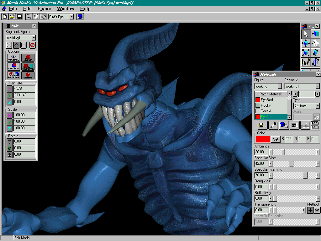
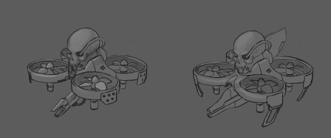
Original 3D model of the Protector Drone from Duke Nukem 3D
In Ion Maiden, we decided to go with 3D modelling as base for our sprites. After agreeing on the direction based on concept art, the enemies are modeled in 3D. Unlike modern games, our 3D models are not the end result. This allows our 3D artist, Arturo, for a faster and more loose workflow. The focus is placed on general look and three dimensional form, many small details are omitted - despite using very large sprite sizes in comparison to past Build games, these details often gets lost after scaling the renders down to the target resolution.
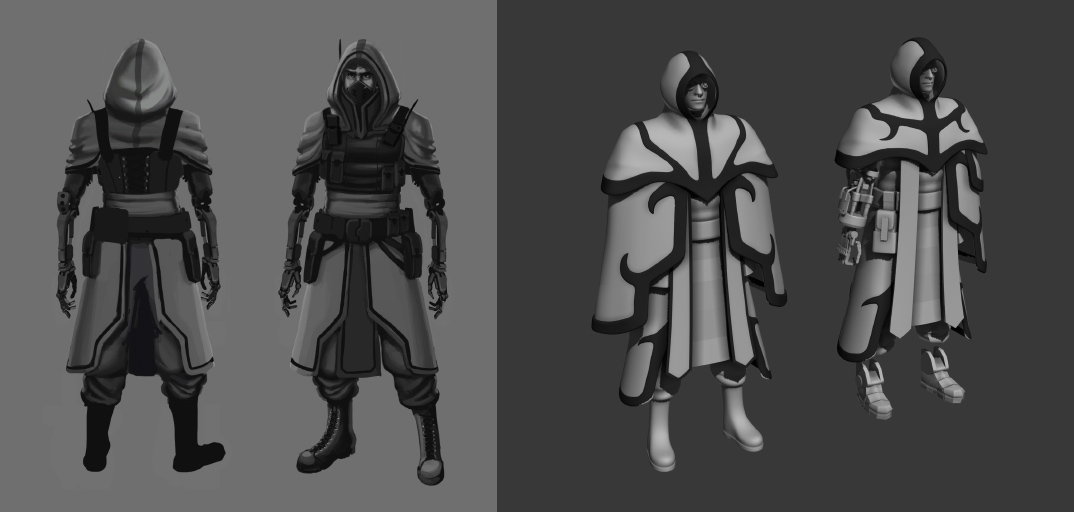
Concept art, WIP 3D model, render and finished sprites of the Lesser Culist
After the model is complete, I take over and set up the light conditions for the render, pick specific frames of the animation and render out all frames in all angles. Afterwards, the renders are taken to Photoshop for overpainting in 2D - I clean everything up for a crisper, more pixel art look, bring back any lost details, polish the sprites and add a bit of stylisation for a consistent, Ion Maiden style. More time than you’d expect goes into this stage, but in the end it makes a huge difference!
Sprites can’t exist in a vacuum though, so let’s move on to the next aspect - environments!
Paint your PBR!
Nowadays “texture” means only one of whole set of images, which create a “surface” or a “material”. Game engines allow for a lot more visual fidelity than twenty years ago. With more complex geometry, real time lights and reflections, using materials with specific defined parameters (using either numeric values or image data) like reflectivity, specularity, normal/bump/parallax mapping for added illusion of three dimensionality, creates much more realistic and impressive results.
This kind of workflow started taking off around the time of games like Doom 3 and Half-Life 2 (both 2004), with computer hardware becoming strong enough to rely less on precalculating everything. Late '90s games added in some minor effects like specularity or using reflection maps, but back then the textures did all the heavy lifting. With low poly geometry and no dynamic parameters besides the light value (either pre-set by a level designer like in Build, or precomputed from lightmaps), it was all up to the artist to create a believable illusion of a high tech computer, a rough cliff casting deep shadows, or a biotechnological alien hive.
Redneck Rampage (1997) even added light effects in its textures.
Essentially, in a retro engine the textures are the wallpapers that make up your whole environment, together with the geometry created by the level designer. They play a huge part in making the game look interesting as well as communicating specific things to the player - from warning them that something can be damaging, interactive, or communicating the setting they’re placed in. The technical aspects of making textures is both complex and challenging, from conveying the reflectivity of glass to creating minute details of machines and technology. It's a time consuming process. However, by giving complete control over it, directly to the artist, textures can be quite expressive.
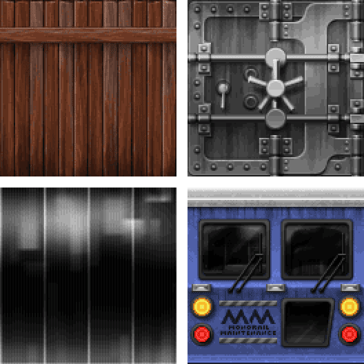
A few texture examples from Ion Maiden with varying complexity.
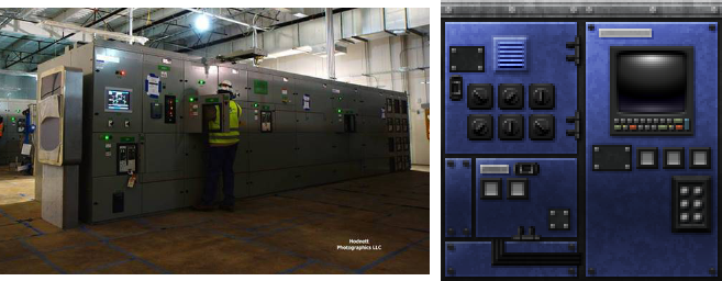
With Ion Maiden’s setting somewhat grounded in reality, many textures have been referenced from photographs, or based on photo sources, but photo textures are never used directly. Photographs available for use are very high resolution. Meanwhile our textures appear in very low resolution - 128x128 being the usual standard. High detail crammed into a such small image never ends up looking good - the clarity and readability get lost, and details turn blurry or change into unnecessary noise. My approach is to recreate such a texture based on photo material from scratch. This way it’s easier to choose what is unnecessary, remove it and have a very crisp, “pixel-perfect” image. I can also more fluidly enforce certain stylistic rules I have established, like the specific way I depict CRT screens, or the types of angles/bevels in “3D” constructions.
Inspiration and the finished texture.
No matter what the quality of your textures or spritework, there is one more factor that can make it or break it completely - color palette.
The dictatorship of VGA
I’m sure that the jump from EGA’s 16 predefined colors to VGA’s 256 colors (out of possible 262,144) was quite a leap for both developers and gamers back in the day. From today’s point of view, 256 seems like a ridiculously low number. All artwork is bound to this limited color palette, so it was something that had to be chosen early, and chosen well. With those 256 being the only colors you can choose, it has an enormous impact on how the game looks.
256 color palette of Ion Maiden
Creating such a palette really is challenge. The hard limit forces to you to find a balance between the number of different hues, and the number of lightness values for each color. The number of light values is especially important - different light values and the very characteristic dark fog effect of old first person shooters are something that made their environments a lot more alive, varied, and immersive. Not enough colors in a color ramp may cause a lot of degradation and loss of detail in dark areas and reduce the fog to a very unconvincing “step” effect. More values will allow for a much smoother look, but will limit the amount of different colors you are able to use - possibly limiting the number of themes you’ll be able to convey, or the effects you can create.
Because of all those limits, it was difficult to have enough colors in the palette to depict light color influencing the environment, so most artists went for choosing local colors of the objects they needed for their environment - green for grass, brown for ground or wood, red for blood, gray and blue for metal and skies, etc. Although it sounds like a “coloring book” approach to color, it still left a lot of room for individuality and was used with great results. In Ion Maiden we decided to put more emphasis on different colors, most of them having two variations. We were able to optimise the palette by making some of the darkest shades shared between the colors. This allowed for pretty varied and vibrant environments at the cost of having to work around some color banding - old school dithering or adding extra detail to break up a surface works well!
Light effects in Ion Maiden
Despite the limited color count, the developers found ways to show off quite a few cool visual effects. Transparency had to use predefined lookup tables that would tell the game what would be the intermediate between the foreground and background color, additive and multiplicative transparency would be possible using this system as well. Color lighting has found its way to the build engine - it was difficult to do it gradually and subtly, so artists and level designers went for a very colorful, contrasted look, by shifting whole areas into specific colors. We have used this approach in Ion Maiden as well, but we have expanded it with specialised light and shadow sprites using add/multi transparency allowing us to create fluid transitions and more realistic/modern lighting effects! And, all of that can be controlled by the level designer!
Power to the people!
One of our design goals was to make the available assets flexible for creative use by the level designers - inspired by Duke Nukem 3D, and over 20 years of custom levels made for it. Besides adjusting the scale and panning of textures, Build games featured the ability to shift the colors of their textures and sprites for visual and gameplay variety. This has not only been brought back in Ion Maiden, but greatly expanded. Besides shifting the whole texture to a specific color, most of the art uses special blue colors that can be shifted to any other hue from our palette. We also have grayscale, color inversion with tinting, lowering/boosting of saturation or contrast and others.
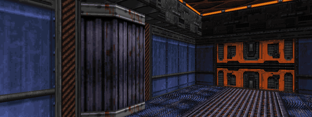
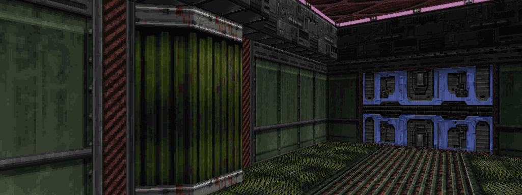
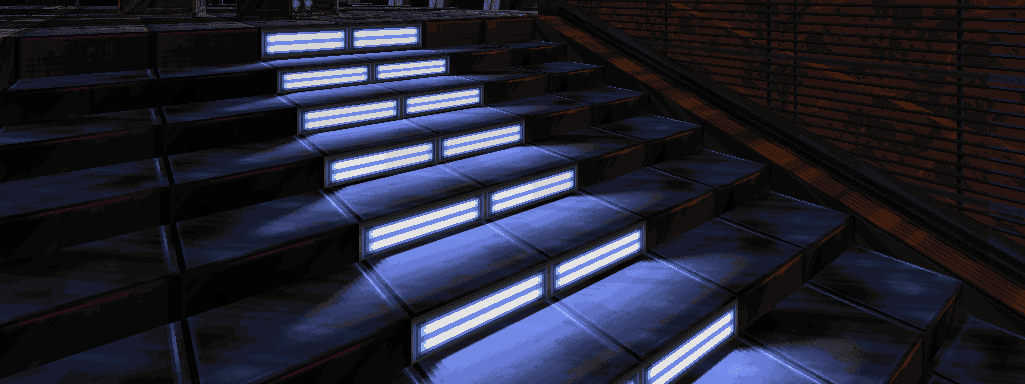
Two versions of the same room
Together with the assets designed for this, it really brings control into the hands of the level designer. This is drastically different from the approach seen in modern games, where the main concern of level designer is creating layouts that will create good gameplay and progression which is then passed to separate “set-dresser” designers/artist who populate the layout with specifically crafted assets. With the visual complexity of modern games it is a necessity, but by using the Build engine we could go back to the 90s very hands on workflow of the past - the same one that allows the designer’s individual creativity to shine and create experiences that you remember twenty years later! And since we’re planning to release the modding tools with the full game, we hope you will enjoy this expressive approach as well.
That was technical…
Making any game is demanding and you’re bound to run into problems, which you have to solve along the way. With the path we have chosen for Ion Maiden, the challenges we had to face, were more technical than creative, but I guess that comes with being a trailblazer (or crazy!) - after all, we’re making the first Build engine game since 1999! I admit I’ve lost a bit of hair over some of the sprites or textures, but making a '90s style first person shooter has always been my fantasy and it’s coming true right now. Being a part of it, is a really fun ride and I hope you’ll enjoy our game, not only for it’s shooting action, but also its pixelated art style.

-Aleksander Kowalczyk, Art Lead