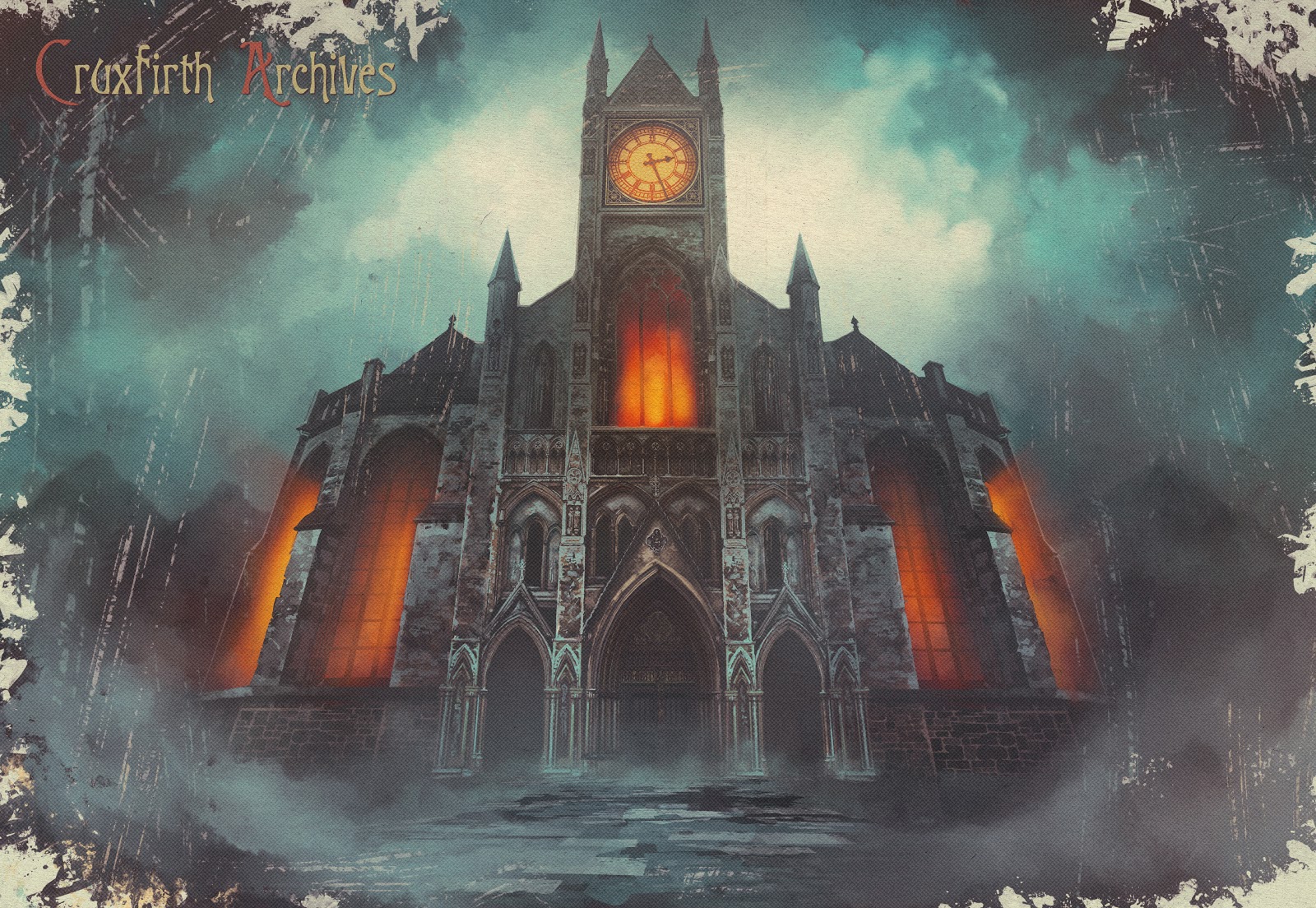
Hello guys, this is Bebeto, art director for GRAVEN.
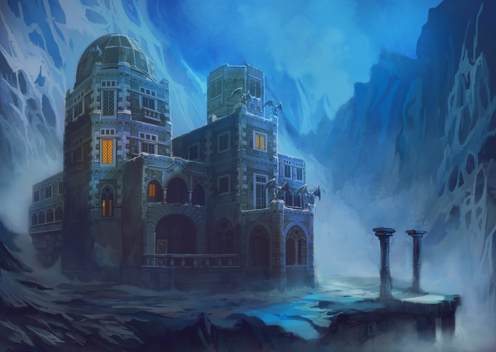
Let me take you through the process of creating the visual identity for GRAVEN. For this, I’ll stick mostly with the environments that were seen in the demo.
Overall Look
From the start, the intention was making a spiritual successor to Hexen and Heretic, games that most of us loved and played endlessly (or until it was time to go to school in the morning!). Back in the day, I remember playing Hexen with a couple of friends taking turns, and how we would be amazed by the atmosphere, how sometimes it was fantastic, other times scary as hell. That was something to aim for; to convey the sense (and scale) of a fantastic, brutal, and cruel world within the stylistic boundaries of our retro aesthetics.
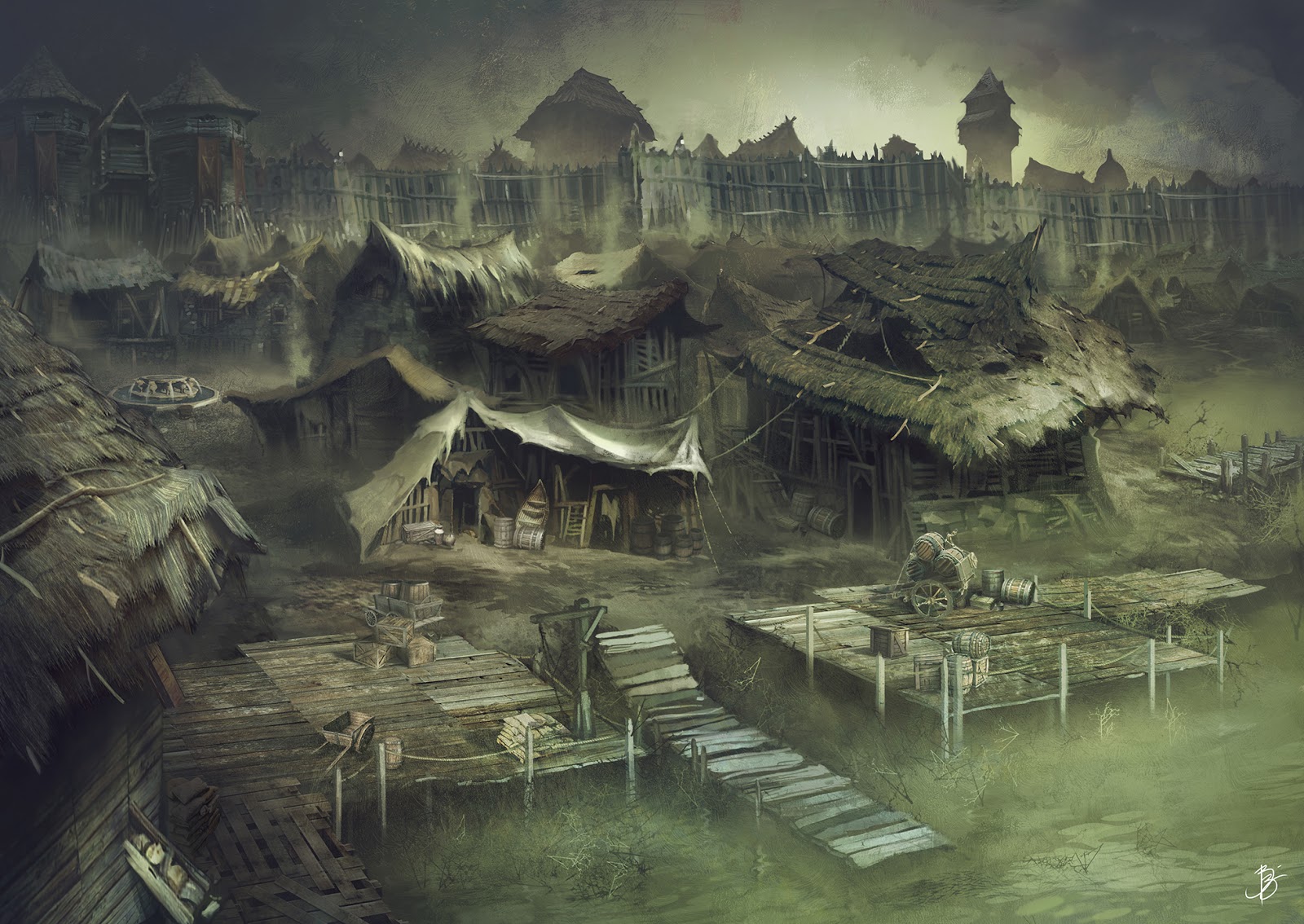
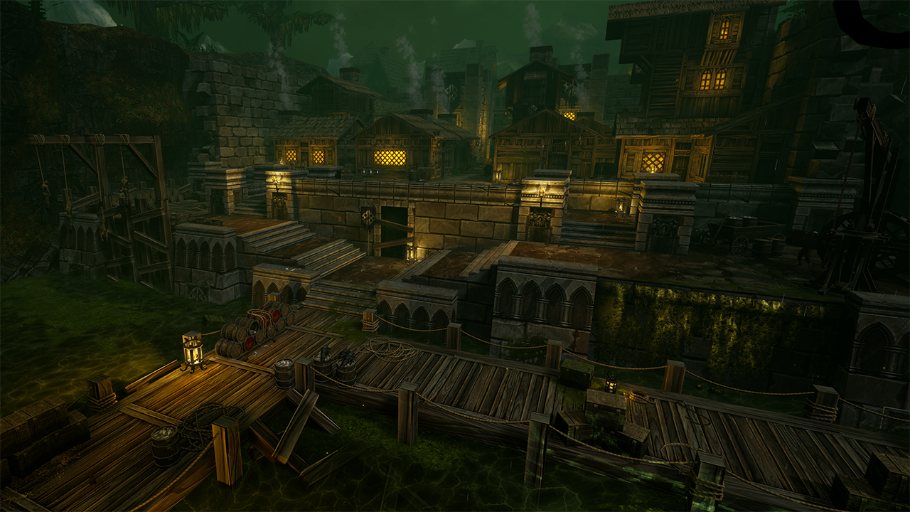
The first thing I've settled for was the greenish/brownish color scheme for Cruxfirth, our first location. I felt it enforced the idea of a plague/infection, while also making a statement that this is not going to be the kind of happy colorful fantasy, no sir! As in maps of Old: Hic Sunt Leones (Here be Dragons - figuratively!!).
The grim tone of a place once thriving and now completely decadent was suggested by my early concepts but was brought to life in full by the team, who took the original concept and made it breathe with life, as can be seen in the game’s intro.
Architecture and technology
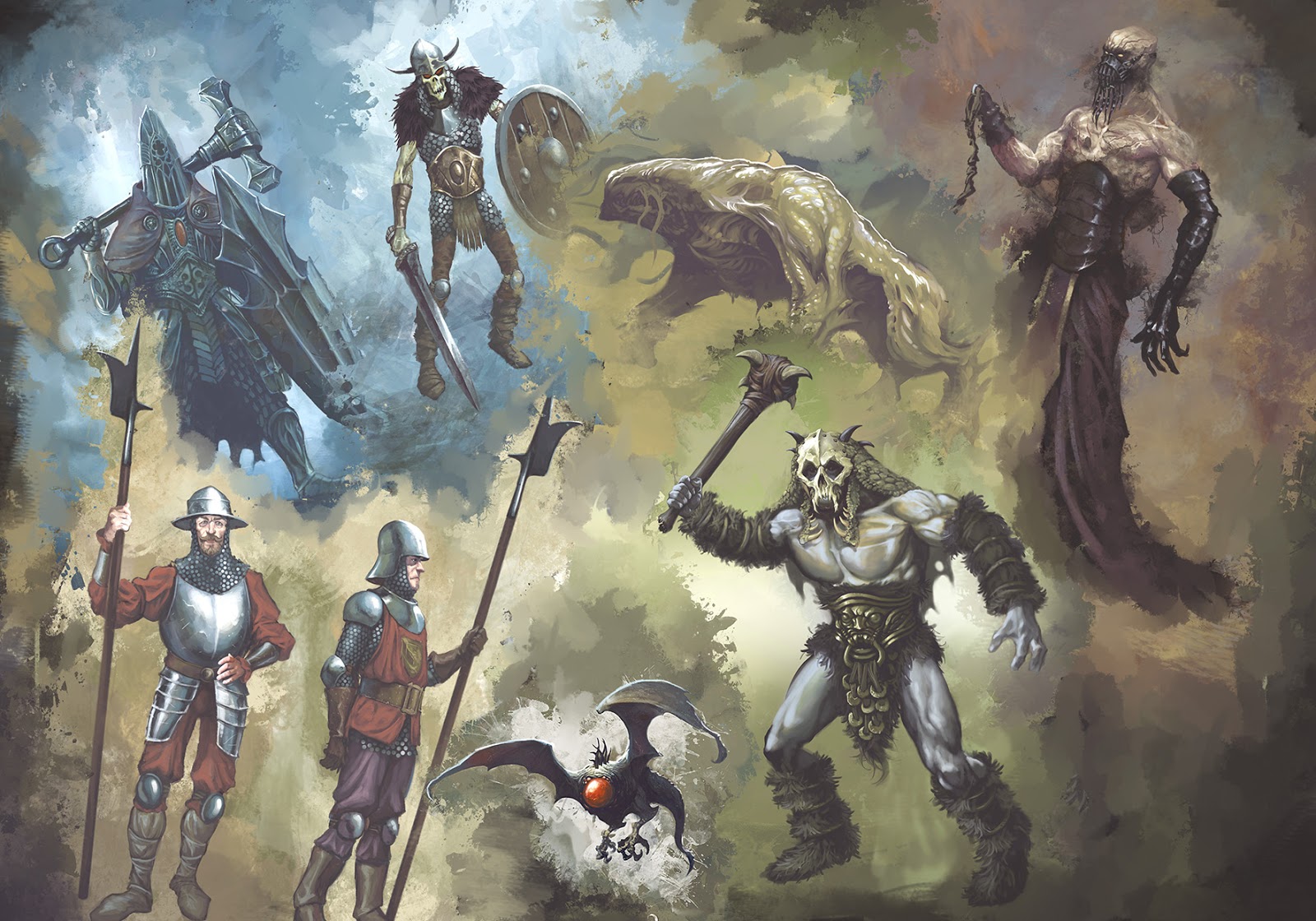
Since it's a fantasy setting, we could take some liberties with the environments and technology. In the world of GRAVEN, you might face armored warriors, fur-clad barbarians, wizards and weird creatures. Depending on where you are, gothic architecture coexists with medieval castles, swords and maces with fantastic ranged weapons (mostly designed by the bad-ass Arturo Padua). And MAGIC. This allowed us to achieve a lot of variety in terms of environments.
Characters
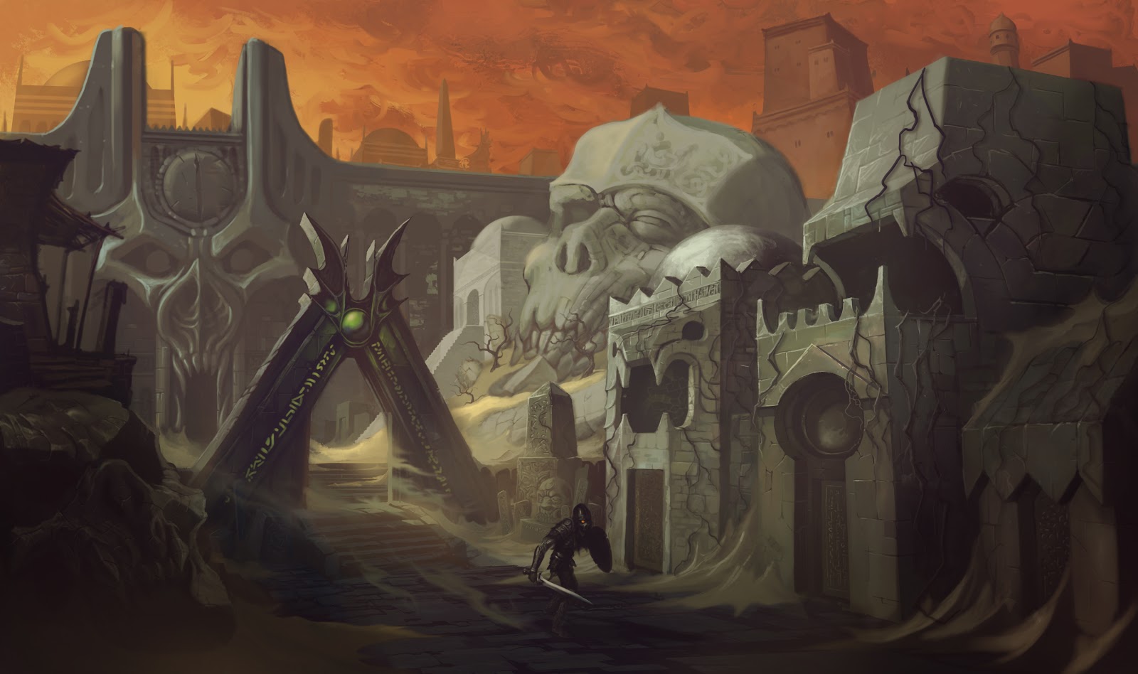
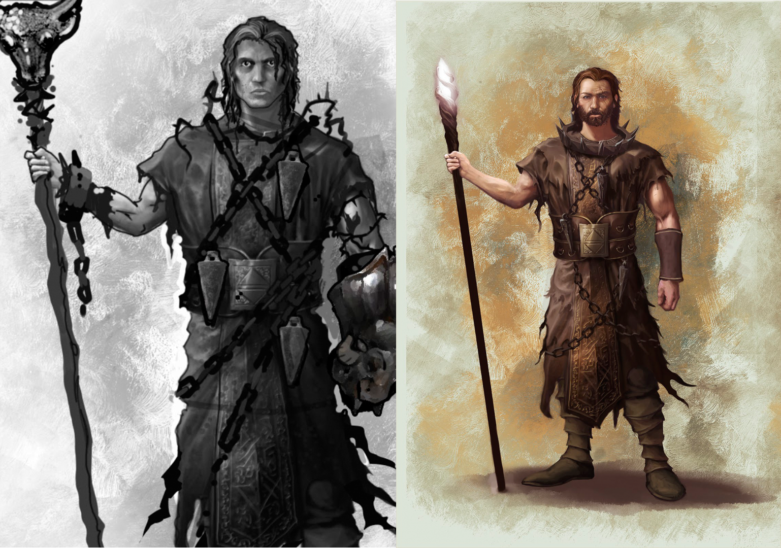
Sad to say, but in the world of GRAVEN, regular folks are not the healthiest looking fellas. Life is tough and, you know, lots of bad magic goin’ on. So our hero had to be more of an average physically fit person, than a bodybuilding killing machine. Somewhere along the way he started to resemble Chris Holden, our Lead Level Designer.
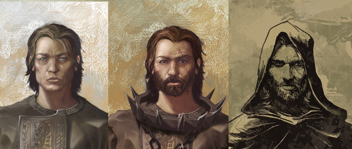
Some suggestions by the amazing Chuck Jones, and our hero was ready to be kicked out into the desert.
Enemies
Given the retro feel of the game, I felt it fitting to look for old school fantasy references and make ’em MORE BAD ASS. I'm talking 80’s Conan, the D&D tv show, Masters of the Universe, Frank Frazetta etc. That's how a character such as the Dihedral Cleric came to be.
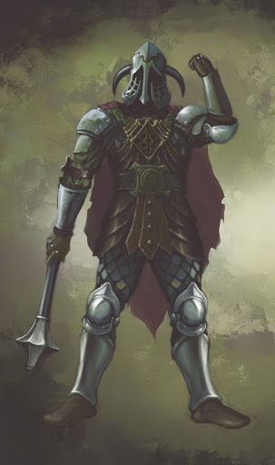
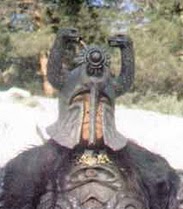
As with the environments, I was able to mix different styles both realistic and fantastic.
Real World weirdness also played a part, as in the Mire Reaver Sword.
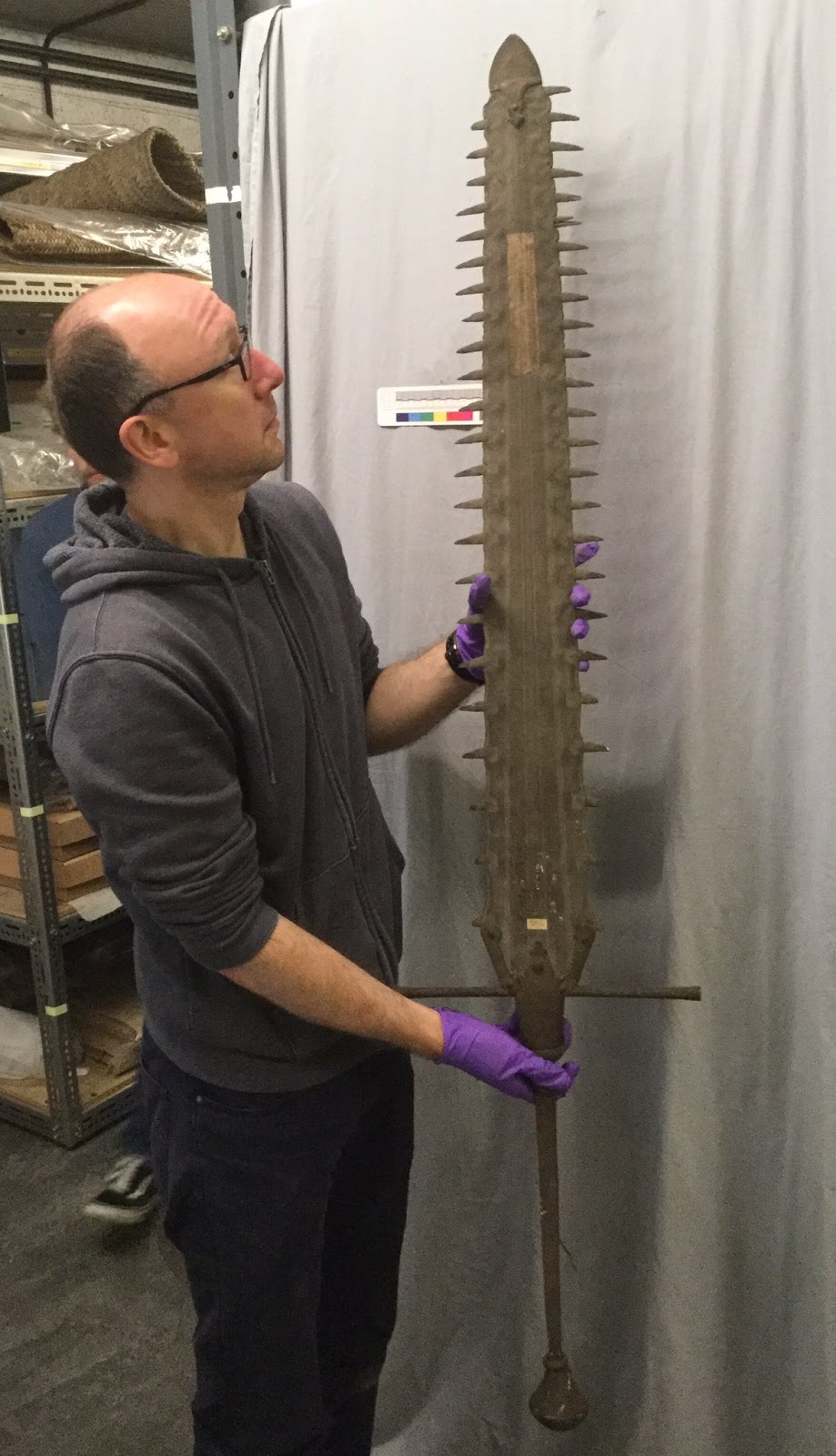
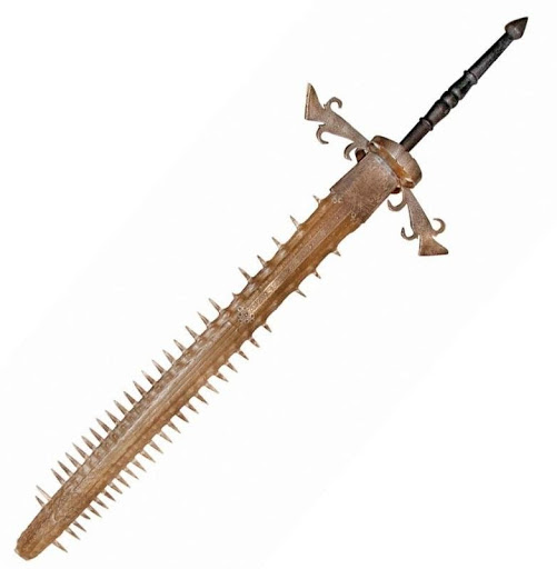
(Yes, sawfish swords seem to have been a thing!)
Overall, my aim was to find balance between something fresh looking but also something you might recognize in the back of your head.
So that's it for the moment. I hope you have enjoyed this small glimpse at the thought process going on behind the art direction of GRAVEN. At the stage we’re at, we’re still coming up with a lot of cool stuff, so hopefully, in time we’ll meet again in the not so safe but fantastic world of GRAVEN.
Happy Holidays to all of you! And in case you haven’t done already, don’t forget to add GRAVEN to your Steam Wishlist as well as on GOG!
By Bebeto Daroz - Art Director

